Client Work
A Logo that Earns a Second Look
The logo was already there. I just had to see it.
These are the stories behind the work — the challenges, the thinking, and the results that happen when design is rooted in strategy.
Logo Design · Brand Identity · Competition Winner
Gate River Run 15K
50th Anniversary Logo · Jacksonville, Florida
#1
out of hundreds of entries
50
years of race history honored
The Client
The Gate River Run 15K is the largest 15K road race in the United States, drawing more than 20,000 runners to Jacksonville, Florida every March. It also serves as the official USA Track & Field National 15K Championship — meaning the same course that neighborhood joggers and charity walkers navigate is also where the fastest 15K runners in the country compete.
In 2027, the race celebrates its 50th anniversary — a milestone that called for a memorable logo worthy of five decades of community, grit, and tradition. The organization opened a public design competition for a commemorative logo worthy of this milestone.
Most designers would start with the brief.
I started with a Google search.
The Challenge
Designing a 50th anniversary logo for an iconic race is not a neutral creative exercise. The logo needed to honor the history of the race, feel distinctly Jacksonville, work across every application from race bibs to embroidered apparel to large-format signage, and stand out over a hundred competition entries.
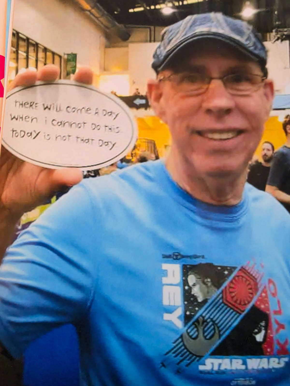
I'm not from Jacksonville. I didn't grow up knowing the course, the culture, or the community the way my husband did. But I knew one thing: my father-in-law, John Waller, is one of only 17 remaining Gate River Run streakers — people who have completed every single running of the race since 1978. He finished one year from a wheelchair after breaking his femur. Because for a streaker, missing it simply isn't an option.
When John sent me the contest, I almost didn't enter. I knew the winning logo would need a phenomenal concept and a great story. We had the story. The logo part...I didn't have a concept.
But the graphic designer in me wouldn't let "no" come that easily. So before I decided to call it quits, I did a half-hearted Google search of the only thing I knew: the Hart Bridge. If I was going to design a logo, this bridge had to be in it.
A designer also needs to keep the client's needs and desires top of mind, and the requirements were specific: six colors maximum, embroiderable at a small scale, and vector artwork with outlined fonts. The logo needed to work on race bibs, finisher medals, apparel, signage, and digital media simultaneously.
The initial logo brief stated that they were looking for "a vintage-inspired, throwback logo that feels professional and memorable enough to work across website and digital promotions, race shirts and merchandise, medals, and signage and print materials."
As a print designer with 15+ years of experience, these were design constraints before the very first mark was made.
The Solution
Act 1 — The Original Concept
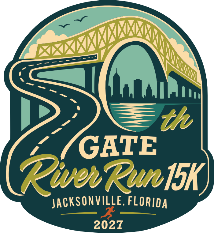
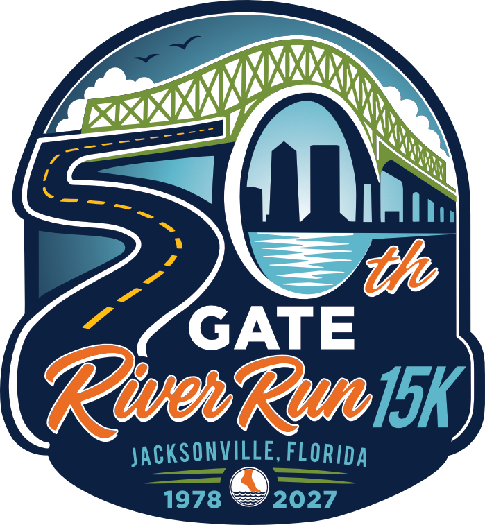
Runners call it the Green Monster. It's the punishing final climb that separates the finishers from the finalists — the hill every runner sees coming from a mile away and dreads from the moment they wake up on race morning. And when I pulled up that first photo, I didn't see a road and a bridge. I saw a 5.
The road winding toward it curved exactly like the bottom half of the number. And since the logo required a "50," I kept looking, knowing there was a 0 somewhere. Then I saw it: the soaring arch of the bridge closed into that 0. The number 50 was already there — built into the most iconic landmark of the course itself — waiting for someone to see it.
That's the moment I knew I had something.
Not simply a logo concept. A discovery. And once I saw it, it couldn't be unseen.
The best brand ideas don't feel invented. They feel inevitable — like they were always there and someone finally had the presence of mind to notice. This was one of those moments. The concept was immediate, entirely original, and impossible to walk away from.
But the design was also personal in another way:
Inkling Creative was founded on the belief that the most powerful brands don't just get noticed — they get remembered. That conviction was hard-won. After surviving a traumatic brain injury and rebuilding the ability to form and hold memories from the ground up, as Inkling's founder and designer of this mark, I understand memory, not just as a marketing concept, but as something fragile, precious, powerful, and worth fighting for. Making companies and events memorable isn't a tagline. It's a calling. When the committee said they wanted a memorable logo, it felt like they were calling my name.
My initial logo may not have been the most colorful and didn't "pop" as much as other finalists, but I am a strict rule follower. I sought to make tasteful decisions that closely followed the committee's rules and stated desires. (Vintage logos are typically less eye-catching, and designing for print usually means keeping detail to a minimum.)
Act 2 — The Revision Round
The committee selected my logo as a finalist (!) and requested three specific changes before making their final decision:
- Typeface update: "GATE" was updated to a clean block sans serif to align with GATE's existing brand identity. This would add authority and consistency.
- Date revision: "2027" was replaced with "1978–2027" to honor the full 50-year span of the race's history. I made this font the same a "GATE" to add structural cohesion within the logo.
- Skyline accuracy: I refined the original skyline silhouette to incorporate recognizable Jacksonville landmarks, most notably the distinctive point of the Bank of America Tower and the Wells Fargo Center, making the cityscape unmistakably Jacksonville rather than what could be seen as a generic downtown.
Each revision was an opportunity — not just to satisfy a checklist, but to make the mark stronger. The typeface change brought more authority and modernity. The date range added historical weight. The skyline update gave the logo a sense of place that the original concept had only implied.
After a nerve-wracking few weeks, I was sitting down to breakfast on our first family vacation since our son was born when I received an email: "Our logo committee has declared your submission the winner."
Act 3 — The Final Mark
What follows any concept are necessary design decisions. A concept is just a starting point. What separates a great logo from a lucky idea is every decision that follows. When my logo was selected as the winner, the committee requested a few additional revisions.
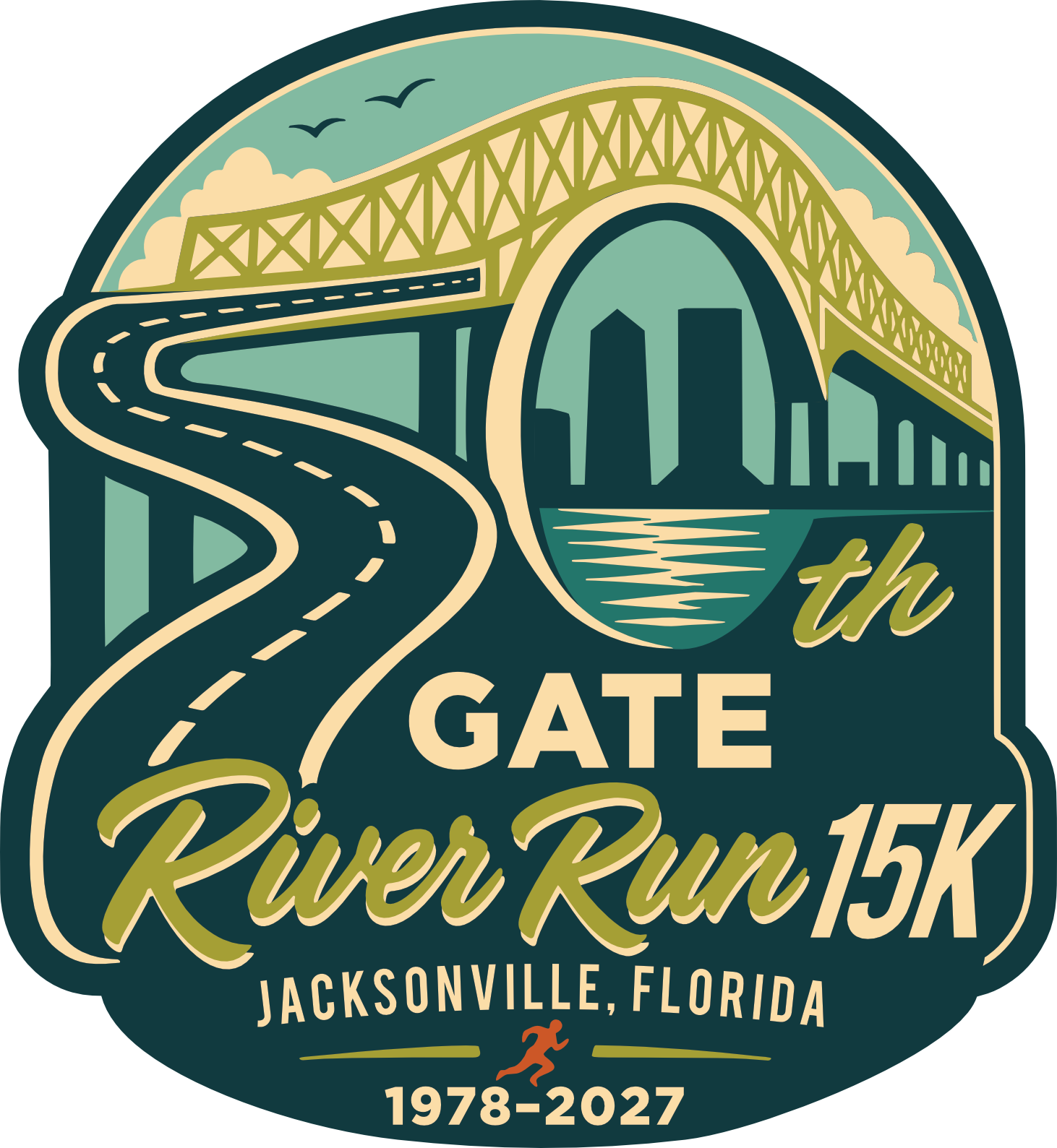
The color palette. Initially, the committee wanted a vintage aesthetic grounding the mark in the race's timelessness. But when it came to finalizing the logo, they wanted a brighter, more energetic palette with more visual pop — colors that would read from a distance on a race shirt, hold on an embroidered hat, and work across every application without adaptation. The final palette: navy, lime green, aqua, orange, gold, and white. Bold, contemporary, and built for reproduction.
The date range. Rather than simply declaring the year, the committee wanted the logo to mark the race's 50-year history. The date was then to read "1978–2027."
The 1978 mark. Instead of a runner at the bottom, the committee wanted to include the original Gate River Run logo — the foot of a runner emerging from water. It now sits between "1978" and "2027" at the base of the badge. It ties the anniversary directly to the race's origin. Not just celebrating where they are, but honoring where they started.
The road leading to the Green Monster. From the moment I saw the "5," there were design decisions to make. I saw a 5, but how much adaptation was required so that others would see it too? After trying it multiple ways, I leaned conservative to keep the integrity of the road shape. But knowing their audience, the committee wanted a more legible and obvious 5.
River Run competitors that have seen the logo have told me they know this road well and envision themselves on it as they approach the daunting Green Monster. This, in my mind, is another win. (When running it, I wonder if they will now imagine themselves running "the 5...")
The Results
When the logo was selected as the winner of the 50th Anniversary Gate River Run logo competition, the judging committee cited some of its reasons for the selection:
- Including all required design elements specified by the committee [*rule-following]
- Submitting properly separated vector artwork
The final logo will appear across all 50th anniversary applications — apparel, medals, race bibs, signage, digital media, and merchandise — reaching more than 20,000 runners, spectators, and sponsors annually. I hope everyone is excited. Whether someone is a first-time runner, a streaker, or somewhere in between, I hope they feel like part of something bigger than themselves when they see this logo. We all need a healthy dose of humility, right?
The Gate River Run 50th logo committee especially liked your concept of what the runner actually envisioned as they approached the Hart Bridge. We also liked the way you built the 50th into your logo."
— Doug Alred, Gate River Run Race Director
The Takeaway
The best logos don't just identify — they tell a story worth remembering.
The revision process didn't dilute the original vision. It sharpened it. That's what happens when a designer understands not just how to make something beautiful, but how to make something that serves its purpose across every surface it will ever touch.
Every brand, every event, every anniversary has a concept, a story, hiding inside it — something true, specific, and already there — waiting for someone to look at it the right way.
It might be in the way you built your business. The problem you set out to solve. The thing your best clients say about you that you've never thought to put on your website.
It's the story your work is already telling that nobody has had the presence of mind to notice yet.
That's what I look for. Not what a brand should look like. What it already is.
What story is hiding inside your brand?
Let's find it together →
Ready to make your company memorable?