One hundred years in any undertaking is rare, but for a church? “Extraordinary” as one pastor put it.
Several months ago Pastor Todd from my church, Grace Immanuel Bible Church, told me that we — our church — were turning 100 this year!
Because of this, we were gonna celebrate. And he asked Inkling Creative for help branding this event. I was so humbled that he asked for my involvement — what a privilege!
Project: Event Branding and Booklet Design
Pastor Todd started off by describing their vision. Because we were celebrating a centennial, the theme of the event branding would be vintage.
First they wanted a logo to “brand” the event, and this logo would go on almost everything.
Beyond the logo, at various points they also wanted:
- Hats
- Coins
- Flags
- Banners
- Posters/flyers and
- Booklets

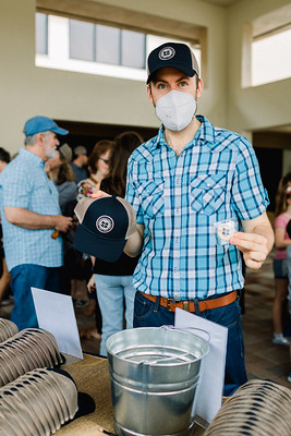
Shawn handing out hats and coins
The hats and coins were handouts for celebration-attendees. (You can see the hats and coins we designed here. The design process for these could be their own posts — please let me know if you would like that.) The flags and banner were part of the event branding as decorations outside. The flyers were posted around the church announcing the event (along with another “banner” on the website).
While I was excited to be intimately involved with all of these things, I was most excited for the booklet. (Publication design is my favorite.)
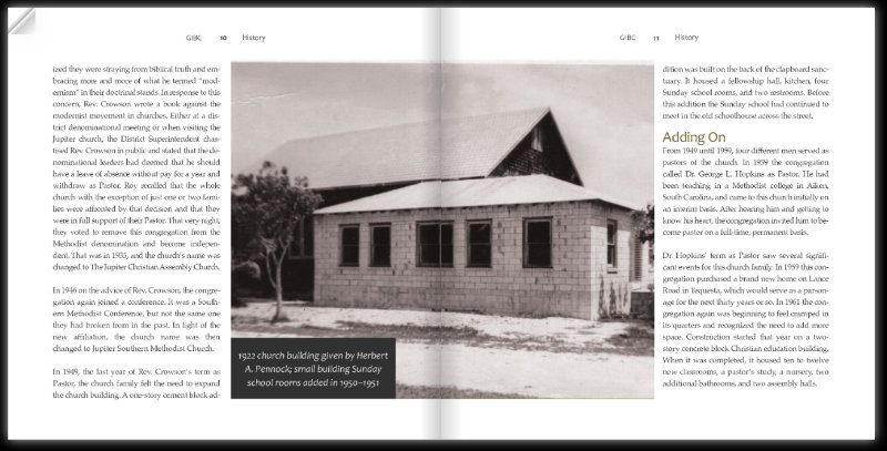
This booklet shares the 100-year history of Grace Immanuel Bible Church. With pictures illustrating key events, the booklet serves as a “history book” of sorts for our church. It describes and celebrates 100 years of God’s faithfulness.
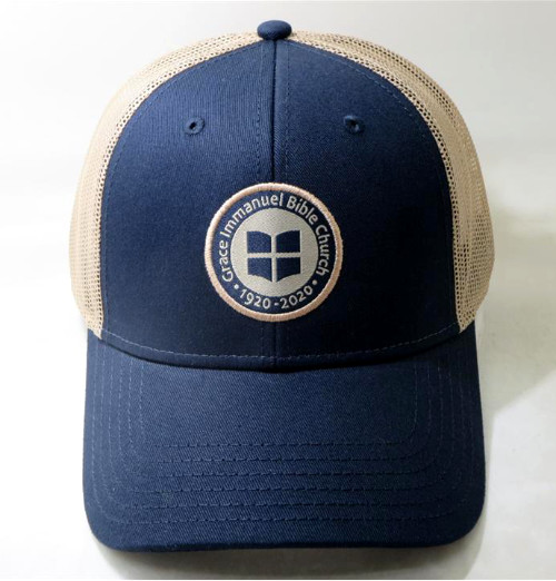
GIBC Anniversary Hat
Research
For booklet design (or really any design), a theme is necessary. Since this was the “Centennial Celebration,” they told us that the theme and style of the event itself was vintage.
And thankfully, this booklet design was the last of the projects to work on. Because of this, the event already had the main brand elements — the fonts, the colors, and the general style. (These are very important to maintain brand consistency, and especially event branding..)
So our research was fairly straightforward. We kept the style in line with our event branding. We simply used the design elements already decided upon, and did a little research on “vintage publication design.”
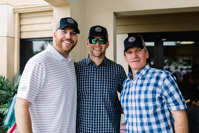
Anniversary Celebration Hats for Attendees
Concept: Booklet Design
I browsed for elements to use in creating vintage publication and booklet design. We realized that, while there definitely are some vintage elements, we really just needed to create on-brand, consistent, clean design.
With the event branding in its entirety, we tried to work in a few vintage elements. For the event itself, we had hay bales, vintage games, and so on.
So for the booklet, I also tried to work in some vintage elements (namely, the caption design), but we didn’t want this book to age easily. More about that later (see "style").
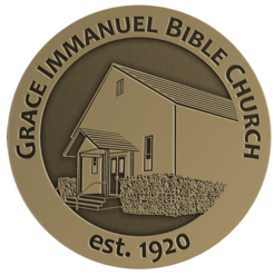
Back of GIBC Challenge Coin
Since we were using scans of dated photos, most of the vintage-theme would come from those. But we also considered the use of fonts.
A sans-serif font is automatically more modern. A serif font is naturally more traditional. Hence, the headings used were in a sans-serif font. The body text, or the majority of the text on the other hand, was in a more traditional, serif font.
We were also concerned about the booklet cover. As Todd spoke about this particular project, I noticed a key theme in his speech. He wanted this booklet to be a “keepsake.”
With that in mind, we wanted to do something unique for the cover.

Front of GIBC Challenge Coin
Style
While the theme of the event branding and booklet was “vintage,” Inkling Creative’s general style for designs is described as “clean.” This means un-cluttering the layout, removing distractions, and using lots of white space.
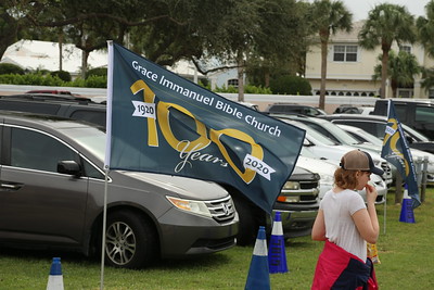
100 Years Celebration Flag
Keeping things clean, with a clean design, clean pages, and a clean style, helps brain processes. Designs are quicker and easier to digest.
We thought this melded perfectly with a timeless history book for the church.
"Keepsake” also kept repeating itself in my mind. Cleaner styles tend to age better. They include less elements that become dated. And so with “vintage” and “clean” in mind, work began.
Setup
With any branding (including that of an event), a designer needs to know specifics, including specifics of a client's desires.
Before design and layout of a booklet begins, a designer needs to know the final size of the document. A square was mentioned as a unique option, so we went with a standard square size: 8”x8.”
If there is flexibility on the size, sometimes we find that the size we try initially doesn’t work. It must be changed. But this time, a square booklet worked out well.
Layout
With this, the layout process began. After setting up the document’s sizing and margins, decisions needed to be made regarding placement of page headers and numbers.
To make sure these elements are in the exact same spot on each page, they need to go on what is called a “master page.” We thought a clean, easily visible, yet out-of-the-way location would be at the top of the page.
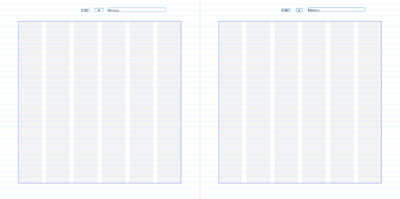
Master Pages
To start, we were given a Word document with simply a block of text (with picture placement suggestions) as well as a Dropbox folder full of images.
The challenge came in figuring out the most efficient way to get the right images with the correct text. So we converted the “picture placement suggestions” text into heading text.
This needed to be done to simply get everything into my Affinity Publisher document and figure out which images should go where. But when we finally began deleting these headings, we noticed something…
I mentioned that the booklet project began as a Word document with simply a block of text.
Was this readable? Yes. Was this easy on the eyes? Not particularly. Consequently, I made a suggestion. I emailed and asked:
Good morning,
I had an idea I wanted to run by you. I am thoroughly enjoying designing this booklet, and I was just thinking about subheadings. There currently aren't any. (There are notes on where images should go, and there are sections, but no subheadings.)
I think the addition of subheadings would make the booklet far more readable and reference-able (plus it would give your eye more of a break — there are a lot of images, which is great, but it headings would make it easier).
What are your thoughts?
Thank you!
The response I received back was short and sweet: “Agreed.” So we went about creating and placing headings in the text.
Designing with a Grid
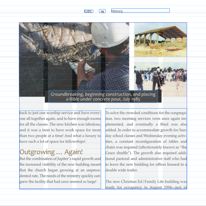
We have previously spoken about designing with a grid here. Choosing a grid that works for the style of your document makes design and layout so much easier. Because we already knew what images went where, it was simply a matter of figuring out what size they should be (how many columns they should stretch) and how they could artistically be placed.
Along with images, another part of the booklet design and content layout was how to format and where to place testimonials. We decided to format these as block quotes, and we did several things to set these testimonials apart from the body text. We made this text:
- Significantly larger
- A different (but consistent) font and
- A different color
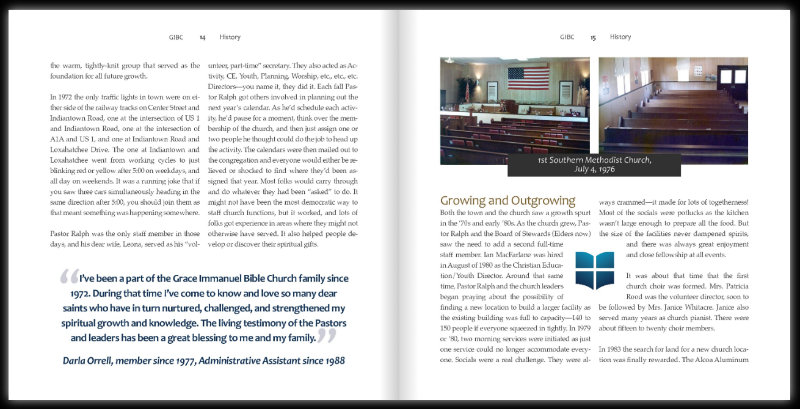
We also made use of a large quotation marks as a design element to draw attention to the quotes. These large, blue quote marks show where these testimonials begin and end. They also make the reader feel like part of the conversation.
Block quotes are one of my favorite parts of publication design.
For placement, to keep with the clean style, we used these testimonials in very text heavy locations. We also used the church logo to add more white space to pages with a lot of text. The placement of these two features accomplished two missions:
- They broke up the text
- They created more white space
Accomplishing these two things does two things for a booklet design: it makes the pages cleaner, and it makes them easier on the eyes. Both very important.
Covers & Binding
One of the final things we needed to decide on were the front and back covers and the binding. We already mentioned we wanted to do something uniqued with the cover. So we came up the “cutout cover” idea.
This cover would be navy linen (vintage quality) with a 3"x3" cutout showing the front page.
Initially, we were going to go with saddle-stitch binding. This is when pages are held together by a simple staple.
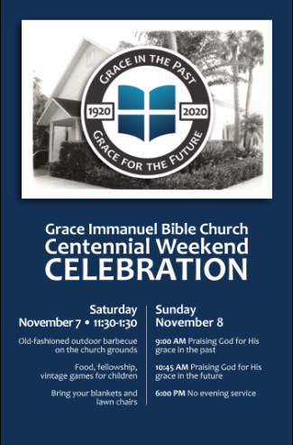
Announcement Poster
And while this worked, books or pamphlets that use saddle-stitching typically don’t lay flat. And while the booklet still looked good, the word keepsake kept ringing in my ears. A saddle-stitched booklet didn’t look like a keepsake to us.
Another issue was the cutout cover. Because saddle-stitching doesn’t lay flat (because the pages are folded), it would be even more difficult to get the window of the cover to line up correctly with image on the first page.
(There are a lot of tricky things to consider when designing and printing booklets.)
Perfect Binding
For these reasons, we went with perfect-binding. A perfect-bound booklet lays flat and has individually cut pages that line up, creating a squared-off spine.
After the design was complete and design decisions were made, it was time to hand the booklet (or at least the file), off to the printer.
There were many people involved with the proofing and editing process, but there are still a lot of nerves involved. You’re hoping everything with the design is correct (your part), but you’re also hoping it prints/cuts/binds correctly (their part).
In this case, in addition to the main pages, the cover had to be die cut (with a square cut out in the center). And this 3”x3”square had to line up perfectly with the logo on the front page. There wasn't much room for shifting.
And it was now out of my hands.
I was nervous.
But Pastor Todd, unintentionally, reassured me, “It’s not like they’ve never done anything like this before.” Reassuring, yes, but that doesn’t calm all the nerves.
But it did result in a a lot of prayer. Scripture tells believers, “do not be anxious about anything, but in everything by prayer and supplication with thanksgiving let your requests be made known to God” (Phil 4:6).
So that’s what I did. I prayed.
Final product
It happened that as this booklet went to print, my husband and I went on a short, but much-needed vacation. This booklet would be done soon after we got back.
The Lord knew I needed our trip to decompress.
So a few days after we got back, I nervously went to pick up the booklets.
And they turned out great. Magnificent. So good. More than one person has called it “a museum in a book.” We were very pleased.
When viewers first look at and handle the booklet, they feel the quality of the navy blue linen cover. They see the antiquity with a cutout portraying the logo on a black and white image. With intrigue, they open and see that black and white image of the original church.
Reading through the pages, viewers get the opportunity to learn about and reflect on the Lord’s faithfulness in the last 100 years.
And as the Lord as shown Himself faithful and good throughout these last one hundred years, through this labor of love, He did so again. He was, once again, abundantly kind.
If you know someone who could benefit from this kind of service, please contact Inkling Creative. We would love to help.

