Strength. Integrity. Respect. Innovation. Excellence. These five words were specifically chosen to describe APEX Waterjetting — an entrepreneur startup in Palm City, Florida whose aspiration is to dominate the ultra high pressure water jetting consumable parts industry. It is this company with whom the Lord has given me the privilege of doing graphic design for the past several months, and they wanted a brand standards manual.
More...
At the end of last year, I was asking my dad if he knew anyone who might need graphic design assistance. Because of my question, he put my in contact with David Friday, formerly the vice president of sales and marketing at Hog Technologies. It turns out that at that moment, he was buying/starting his own company — APEX Waterjetting. He already had a logo designed and was in need of branding assistance. Enter, my dad.
Project
At my dad’s suggestion, Dave looked at my portfolio and we had a meeting. After our meeting, Dave gave me the opportunity to design a graphics standards (or brand standards) manual that would set the tone for the brand. Typically, these manuals give guidelines as to how to use a company logo. Along with logo usage, they explain other visual identity elements such as colors and color applications, secondary graphic elements, brand photography, brand typography. They really help establish brand identity and brand consistency.
I was really surprised that Dave asked me to design a brand standards manual first. But as the former vice president of sales and marketing, he knows the importance of consistent branding and having a purpose behind it. He told me that he saw many occasions where as a result of their lack of brand standards — like this manual — hurt the company's brand impact.
Research
Thrilled at the idea of being able to help a startup with their branding, I first of all needed to research some great brand manual examples. I found several and took note of what they included and what they did well.
My next step was to speak with Dave. We graphic designers have our ideas of how a piece of collateral should look and what all it should include. While our opinions do matter, they’re not what counts. So I needed to speak with him and get his vision for how the company would look — he’s the owner after all.
This was an excellent conversation. In the process of learning some necessary information that needs to go in the manual, I learned his vision for the company look, feel, and brand.
Concept
The concept for this manual was to reflect the ethos of the APEX brand. I thought the best way to exhibit the attributes mentioned earlier was to create something simple, clean, and bold. With some of the key identifying elements on each page — specifically APEX Red and the mountainous watermark.
Layout
Another aspect to building one of these manuals is the layout. After a page template is set up, it’s really not difficult to come up with different pages based on that template. Where the challenge comes in is deciding how to arrange vastly different page elements consistent with the overall look of the manual.

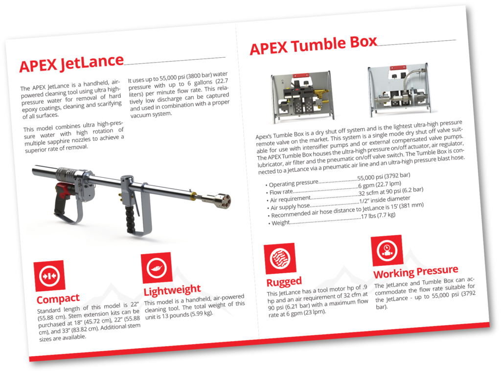
APEX Waterjetting Brand Standards Manual
For example, the logo color applications page is going to look vastly different than the logo misuse page and the logo security area page. This is where a basic page template and designing with a grid come in handy. Both of these features make designing a consistent, multi-page document much easier.

The basic page template starts each page off by giving them common ground. Designing with a grid gives each element a framework to fit into. Basically, designing with a grid begins by establishing common margins for each page. From there, a certain number of columns is decided upon that each page will have.
(The end user cannot actually see the grid a designer designs with.) This makes designing consistently easier because you know that, whether you can “see” it or not, the pages are all designed using the same framework.
Conclusion
As a result of of this and after I finished the brand standards manual (which is still a work in progress as we add new products and branding), Dave liked my work so much that he continues to use me as the graphic designer for APEX Waterjetting. I thoroughly enjoy working for this company. Though designing for a manufacturing company was not in my background, I have thoroughly enjoyed getting to know the industry and I look forward to learning more.
You can view the manual in full size here (this plugin uses Flash which your browser may initially block). Please let me know your thoughts! Why do you think something like this is helpful for a brand? Do you think it's necessary?
Are you an entrepreneur who wants to learn graphic design? The course below may be right for you.

