
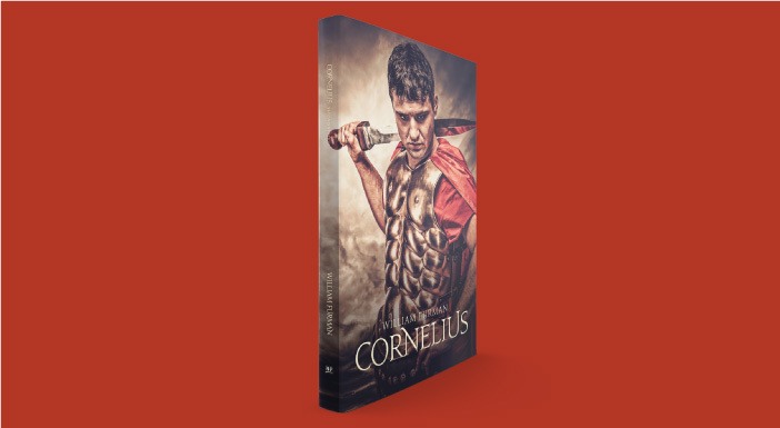
“During the reign of the Roman Emperor Augustus Caesar, a boy by the name of Titus Cornelius became a man. The man became a centurion who became obsessed with identifying a person very different than anyone he had ever known. His quest ultimately changed his life.”
More...
This book, entitled Cornelius*, is a recent project I had the privilege of working on.
Research
When CrossLink welcomed me to their team of graphic designers, this was the second cover design I was asked to complete. The information about the covers they provide to graphic designers comes in a one-page word document along any necessary logos to be included on the back cover. The document includes cover specifications, cover feel (how the author imagines the cover), cover images (that the author may want included), an “about the author” paragraph, an “about the book” paragraph, and any notes.
In this case, the author (William Furman) was very particular in what he wanted. For the cover feel, he mentioned that he specifically wanted “a Roman centurion that displays strength and self sufficiency.” As a fellow creative, I understand that, in a way, creative work is an extension of the creator. If someone insults your work, it feels like they are insulting you. Because of this, authors often have very specific ways they want their book to look. If this is the case, there should most likely be no deviation from it (pick your battles here).
Because this was a second edition of the book, I decided to take a look at the first. Sure enough, the cover had the same theme.
Concept
I knew I had to do two things for this second edition. I needed to create text with a classic, Roman feel, and I needed to find an image of a strong Roman centurion. The first few photos I found were from my free-for-commercial-use stock photography websites, but none of those gave me what I was looking for. Searching around, I found an image on Shutterstock that had the look I thought the author was going for.
Layout
After I found the image, creating the text was next.
The first task was finding a typeface. Font choice can make or break a piece of art. I could go into a long rant about Comic Sans and its overuse and misuse, but a font needs to “fit” its intended purpose. There are certain fonts that express “Ancient Rome” better than others. A childish font would not. I wanted something classic and regal, befitting of the times, so I chose the font Jupiter. This font was specifically designed to reflect the Roman alphabet.
Font choice can make or break a piece of art.
When I decided on a typeface, the next decision was the text effect. What is strong? What is warlike? Metal. Using various text effects in Indesign, I created a book title that assists with the theme and mood of the book. Below is the final composition.
What do you think? What would you have done differently? Need a cover design? Please let me know your thoughts.

*denotes affiliate link