“Using design improves business performance. Businesses that undervalue the importance of design may be missing vital opportunities” says NIBusinessInfo. They continue by saying that design brings a range of commercial benefits if used broadly and thoroughly across your business. Some of those benefits include increased sales, greater customer loyalty, less time to create and market new products, stronger corporate identity, and more.
More...
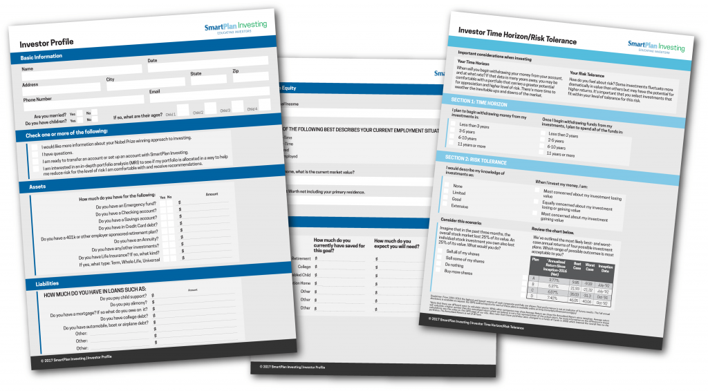
As a designer, it is encouraging when we encounter businesses that understand that, and SmartPlan Investing is one such business. At the beginning of the summer, SmartPlan contacted me about designing one of their online forms. While fascinating isn’t a word typically associated with forms, SmartPlan seeks to make filling out forms as pleasant as possible. They ask their clients to complete these forms so that they receive needed information to better assist the customer.
Research
As this job was referred to me by the designer who previously did the work, the research was simple. I needed to examine the forms previously designed for SmartPlan, and create the new forms in keeping with that format. The colors and central style were essentially chosen for me.
Concept
As this is form design, there is not much new idea creation. The concept here has more to do with the overall look and feel of the form. Forms need to be clear in what they ask, easy to follow, and simple to fill out. With this in mind, I began the form layout.
Layout
Because the form needed to be easy to follow, the layout was the most challenging part of this project. Each of these forms has many sections. The sections include one or more of the following: a basic information section, a checklist section (with one or two columns), a yes/no and fill in the blank section, a plain fill in the blank section, a dollar amount section, a table with three columns, an information provision section, an information table with check boxes, and any combination of the above. The challenge involved displaying each of these sections in a manner visually consistent with the entirety of the form. Each of these sections also needed to be easy to follow and fill out.
After quite a bit of back and forth with changes and corrections, the design was finalized. For the ease of the company and the customer, these forms are posted by SmartPlan and filled out online.
What do you think? Do you appreciate companies with nicely designed forms? What does form design communicate to you about a company? Please comment below with your thoughts.

