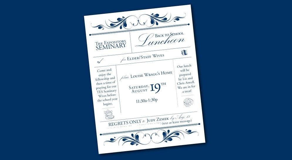
When a man chooses to enter pastoral ministry, it’s not only a big decision for him, but for his wife too (if he is married). And it is for this reason, The Expositors Seminary (TES) held a back to school luncheon. This luncheon was for the elder and staff wives to fellowship together and pray for the wives of the current students. Privileged, I designed the invitation for this special occasion.
More...
Research
Before beginning any sketches or designing, I found out the information the invitation included. After receiving this information, I researched various invitations seeing what kind of style was appropriate.
Concept
The group of ladies that this luncheon was for is a classy group of ladies. They look at life with an appropriate amount of sobriety, yet are not afraid to have fun. Because of this, I wanted an elegant invitation that literally and non-literally said “seminary” as well as “luncheon.”
The invitation depicted “seminary” in several ways. Not only was the name on the invitation, the font choice and colors were those of the TES. To depict that this was a luncheon invitation, different line drawn food and drink elements were included on the invitation.
Layout
A similar theme was kept throughout the invitation, making it appear cultured, yet feminine. The invitation is simplistic in style, yet refined in taste. The fine lines and Victorian borders suggest a sense of sophistication. The script font insinuates elegance and femininity.
I want to hear your thoughts. What elements and style do you think need to be included? Have you seen good examples of this? What do you think is the best way to portray this idea? Would you do things differently?

