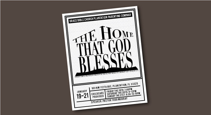
What is the home that God blesses? This question and many more will be answered at Grace Bible Church Plantation the second to last weekend in January. They gave me the privilege of working on the booklet and flyer for the conference.
More...
Concept

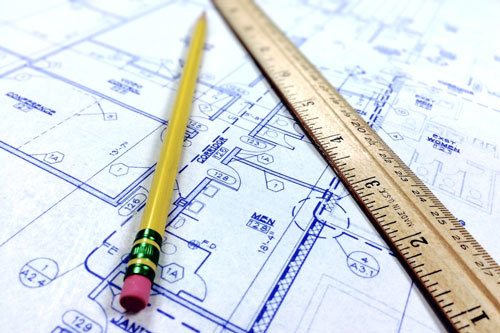
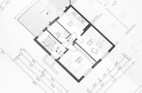
When thinking about the flyer concept, I was originally focused on the idea of blessing, which is difficult to convey. Because my husband and I are looking at houses, blueprints and floor plans were on the mind.
Walking in the beautiful Florida winter one morning (which unfortunately won't last for much longer), Psalm 127:1 came to my mind. This verse says, “Unless the Lord builds the house, those who build it labor in vain.” This reminds me that the home the Lord blesses is built on God’s Word. This seemed like a pretty good flyer concept – a home built on the foundation of the Word of God.
The Bible, blueprints, and floor plans were a good place to start.
Layout
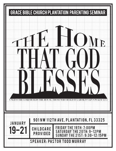
To begin this design, I decided I was going to have a blueprint be the background. I also needed to make the title of the seminar front and center. Because blueprints are for houses, I decided to make the title take the form of a house. As its foundation, this house would have a silhouette of a book - the Bible.
Finishing the flyer, I not only needed to include the title of the series, but the rest of the information as well. Below the main illustration and in a format reminiscent of a floor plan, I included the date, address, times, and speaker.

When designing, designers need to take into consideration how the flyer will be displayed.
When designing, designers also need to take into consideration how the flyer will be displayed. Will it be on screen? Will it be printed and handed out? If printed, what are the printing capabilities? Many churches print flyers on their office printers. Because of this, they cannot print with bleed (when the color extends to the edge of the page). When I know of this printing limitation, it affects my design - I know that when printed, my design will have an automatic white border. Knowing this, I design accordingly - the white border is intentionally incorporated into the design. I think this makes the artwork more complete, more finished - nothing was cut off in the creation of the flyer.

What do you think? How would you have communicated this concept? Do you have any other thoughts? Please comment below.
Also, don't miss a post! Subscribe for the latest news, discounts, and posts from Inkling Creative.

