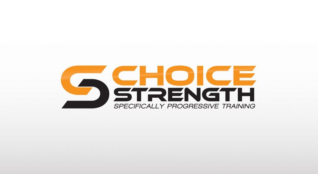
Earlier this summer, someone approached me because he wanted a logo for his startup business. He (Collin) is a personal trainer who intends to create work out and nutrition programs for high school athletes. His business targets this group because many forget about this level in regards to training and injury prevention, and he wants to his business to combat this.
More...
Research
An essential aspect of logo design is that a designer must have an understanding of the business they are branding. The designer must also grasp the desires of the client. Excellent logo design means nothing if the client’s desires are not first understood (and then fulfilled). And so, when I am asked to design a logo, I first send a list of questions that a client must answer. This helps me understand a client’s business and what they have in mind for a logo.
Through this process it was made clear to me what the purpose and mission behind Choice Strength are. Collin also let me know what ideas he had in mind for this logo. He wanted his company logo to be friendly, professional, and sporty.
Concept
The logo design option Collin chose included two concepts and two revisions. Of the logos Collin showed me he liked, one was more of a wordmark and one was more emblematic. Because of this, I followed suit. I designed two concepts for him: one a wordmark and one an emblem.
Because Collin’s business and business name are based on strength, I knew that his logo must appear strong. For this reason, the primary typeface for both concepts is a bold, blocky font. This gives the appearance of strength and stability. Bold colors that convey strength and sportiness were also chosen.
Layout
Another important aspect of logo design is the principle of unity. Unity is the feeling of harmony between all parts of the work of art, which creates a sense of harmony or cohesiveness. This looks different for any piece of art, and it looked different for both logo concepts. Much of this unity actually has to do with choice of typefaces. If there is more than one font, they must be complimentary. Font choice must also compliment the icon or symbol of choice. For the logo that Collin chose as the “winner,” the typeface has unity and cohesion built in. The letters have a unique was of fitting together like puzzle pieces.
But I want to hear your thoughts. What do you think the most important aspects of logo design (or any design) are? What makes design effective in your eyes? Please comment below and let me know.

