Remember the days you visited colleges to see which one you wanted to attend? [If you even went to college, that is.]
Often, that first visit “set the tone” of what your college experience would be like. Was it fun? Energetic? Stuffy? Preppy? Academic? Beachy?
When we talk about “setting the tone” we mean when something sets the feeling, attitude, or quality of something.
Like colleges, each brand has its own tone — it has a feeling that it wants to invoke. When people see, hear, or ... in some cases, smell (*hem* Starbucks) ... your brand, you want them to think or “feel” a certain way.
While your branding itself really establishes what you want your audience to think or feel, where does your branding start? What sets the stage?
This may be obvious, but I'm going to say it anyway: your logo. Your logo is what sets the tone of your branding.
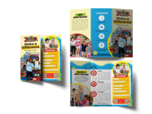
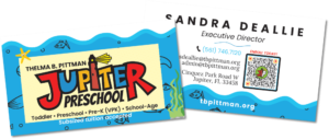
Let me explain from a case study. From the logo to the brochure, I'm quite proud of the work I've done for Jupiter Preschool.
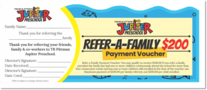
A Case Study
Now my daughter goes to a different school closer to us, but the other day, my husband reminded me to send Jubilee’s teacher’s a picture of “that brochure.” Because I was working on it at the time, I assumed he was talking about the Jupiter Preschool brochure (it turns out he wasn't, but that's beside the point).
Following the “reminder” that I misremembered, I launched into an explanation of how this sort of brochure would not work for Jubilee's school…the really short reason is because the logos are entirely different. While I could design some nice stuff for her school, it would definitely not be as lively. (Or, in my opinion, as cool. But everyone's idea of “cool” is different.)
[Side note: it wasn’t until a few hours later until we realized we were talking about different brochures.]
And that's something I'm learning as I design marketing materials for Inkling. If my materials need to complement my logo (and they must), they can only go a certain direction.
Your Action Item (What does this mean for you?):
If you have the choice, start with a vision of what you want your brand to look like.
Make sure you designer understands that vision in the logo questionnaire process., and then have your logo and branding designed based on that vision.
Or if you already have a logo and just need marketing materials, take advantage of a Design Day to get those created so they can start doing work while you’re not there.
As I noted in the last post, even if your logo doesn’t give the perception you want, there are ways to get around it. Leave that to your designer (me!) to make your marketing materials look the way you want.
Rooting for you!

