When you think about what draws your attention, what do you think of? What comes to my mind are things that are out of the ordinary, such as shouting and loud noises. In the same way, visually, things apart from the norm invite notice. Each circumstance is different, but there are a few elements of design that will distinctly grab attention, and one of those things is the use of color.
More...
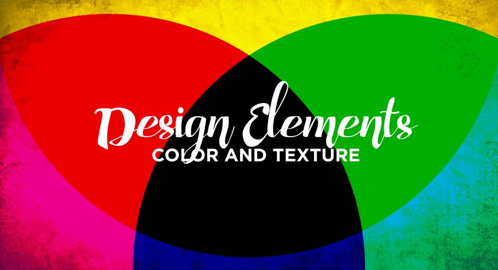
Color
Additive Color (RGB)
Color, by definition, is a property of light. It can be either additive or subtractive. Additive color is created by emitted light – think your computer screen. The additive colors are red, green, and blue (RGB). The various combinations of these colors create the large spectrum that you see on your computer screen or TV (with the addition of all three colors creating white).
Subtractive Color (CMYK)
Subtractive color is created from light reflecting off of a pigmented surface – anything that is printed. The subtractive colors are cyan, magenta, yellow, and black (CMYK), and the combinations of these colors result in dark colors. Addition of 100% “K” results in a true, rich black. The absence (or subtraction) of these colors results in white (a lack of pigment).
As a general rule, RGB colors don't print. Some printers automatically convert RGB to CMYK, but because of the differences in how the colors are created, by definition, they are different. You can get much brighter, more neon colors in RGB than you can in CMYK.
Properties of Color
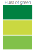
Hue
Color can be only either additive or subtractive. But whether additive or subtractive, there are three properties that can be used to describe a color. These properties are hue, value, and saturation. Hue refers to a color's purest state, such as red, orange, yellow, green, blue, or purple. However, a hue can also be a gradation of one of these pure colors. If someone is describing a flower, but they don’t really know what color it is, they may say “it was a reddish hue.” This means that the flower wasn’t exactly red, but it was in the red family.

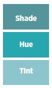
Value
Another property of color is value. Value refers to a colors lightness or darkness. If the purest form of a color is the hue, then a its value refers to its lightness or darkness. Adding white to a color (or subtracting pigment) means that a color is a “tint” of a certain hue. Adding black, or creating a darker value of a hue, creates a shade.

Saturation
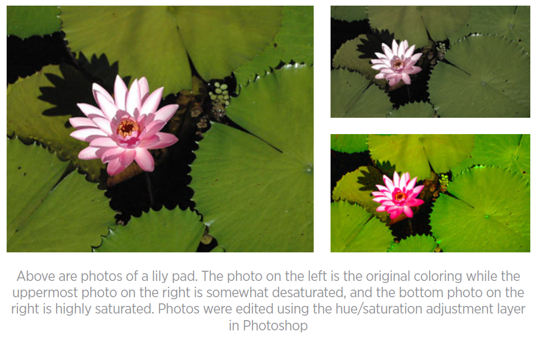
The final property of color is saturation. Saturation, also known as the chroma or intensity of a color, refers to a color's brightness or dullness. For example, a saturated yellow is the sun. A more desaturated yellow is that which you might find in a baby nursery.

Color Temperature
Warm
Another way to describe a color is by temperature. Temperature is more of a psychological aspect to color – certain colors conjure certain feelings. For example, colors with a warm color temperature are reds, oranges, and yellows. They evoke feelings of warmth. This is due in part to what these colors are associated with – sun, fire, and lava.

Cool
On the other hand, cool colors are blues, greens, and purples. These colors are associated with ocean, sky, plants, or ice. These colors summon feelings of calm, still, or cold and because of these associations, blues and greens are cool colors. The environment in which a piece of art is displayed will determine what colors are appropriate and draw the most attention. For example, because an aquarium predominantly consists of cool colors, an image of fire would be out of the ordinary and would draw attention. The goal of the artist and the purpose of the project must be considered to determine if this kind of art would be visually appropriate for the venue. But this is an example of a way to use color to draw attention

Texture
Texture is another way that an image can draw attention. The texture of an object refers to the surface quality of the object in question. It is how an object feels—the sensation that an object provides. Is it rough or smooth, soft or hard? There are two kinds of texture: actual (tactile) and visual (simulated).
Actual
Actual, or tactile, texture refers to how an object actually is. Tactile texture is how your child’s teddy bear or your favorite blanket actually feels. In two-dimensional art, actual texture would be the feeling of the canvas or the surface of the paper. Actual texture can also be created through collage or the thickness of paint and how it is laid upon the paper.
Both color and texture have many facets and can draw attention in unique ways
Visual
Visual, or simulated, texture is not actually felt, but rather suggested. Like color temperature, this element of design is psychological because of suggestion and perception. It is how an object appears. By seeing a photo of your child’s teddy bear, you may get the feeling that it looks very soft. These perceptions are interpreted tactilely.

Visual textures are reproduced or created by using many different methods. The use of lights and darks can suggest tree bark or an uneven sidewalk. Repetition of marks, letters, or shapes also creates visual texture. As we can see, there are many ways to create visual texture.
Both color and texture have many facets and can draw attention in very unique ways. Exceptional use of either can make a piece of art distinct and stand out. Now, having learned the basic elements of design – line, shape, space, color, and texture – we can cover the basic principles. As we learn the design principles, we can use these elements more effectively to make our art clearer and more communicative.