Imagine getting on a plane with no luggage, traveling to your destination, and arriving at a hotel. Upon arrival, the kind desk clerk hands you a package full of clothes and other necessities. Worrying about anything is unnecessary.
More...
Sound too good to be true? That’s JustGO - a distinguished lifestyle / travel concierge brand now here to make travel experiences richer and hassle-free.
That’s the mission of JustGO Concierge — to make professionals comfortable while traveling away from home luggage-free. And it is this company with whom I had the pleasure of working with recently.
Research
A few weeks ago, Roy contacted me about designing a marketing handout for his startup. He stated that he wanted something designed that would quickly grab the attention of a business traveler arriving to or departing from south Florida.

Roy had many ideas for this card. Because he wants to capture people’s attention, he didn’t want the card to be too busy, but disruptive and catchy. He wanted the images on a postcard that convey “technology meets the modern savvy traveler.”

He told me that images might include a business traveler traveling with a Smartphone only, or a hotel receptionist handing a package to a guest. Other potential themes were fashion apparel, sports sets, or sports apparel.
Because “going” is often associated with the color green, Roy chose green as one of his brand colors. He wanted a green circle to be a dominant graphic on this card.
Concept
As a designer, I know that bolder is better when it comes to grabbing attention. Bold images, bold color, or bold text work best when it comes to capturing concentration. Because we wanted a circle suggestive of a traffic light included, I thought a bold, green element would work well on the front of the card.

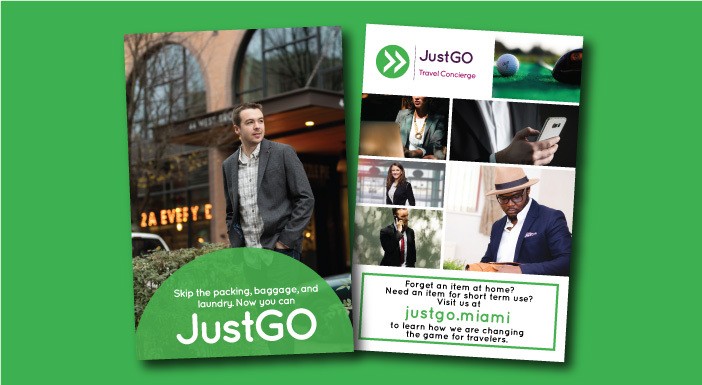
And because JustGO incorporates so many ideas, I thought the best way to communicate the concept without words was with a tasteful photo collage. For the back of the card, I found images connecting business professionals with travel, fashion, and technology.
Layout
After finding the images, the next challenge was laying them out. Because JustGo is a new startup targeting today’s travelers, I knew the style needed to be modern. This means large images, bold colors, and contemporary type.

I wanted images of modern business men and women on the move using various forms of technology. After securing these images, the next step was arranging them. For the front, I chose an image of an Eastern European casual business man who is “going.”
This allowed for the incorporation of text over our large green circle making a simple, but catchy front design.
After I initially sent the proof, Roy came back with some suggested changes. As is often the case, after implementation, the design improved.
Following the proof approval, the order was placed and the cards were received. These cards are an excellent example of using print marketing to gain brand awareness. If you know any business travelers wanting to travel luggage-free and hassle-free, contact JustGO.
Please let me know your thoughts on this concept and card, and share if you found this information helpful.

