
“Opioid abuse is a serious public health issue. Drug overdose deaths are the leading cause of injury death in the United States” says the US Department of Health and Human Services. Normally I'm not one to think or talk about drugs, but this is a big issue that needs to be addressed.
This epidemic is one of the problems that Palm Beach Atlantic (PBA) counseling alumni battle daily. Palm Beach Atlantic president’s report wanted to report on this issue, and I was contacted about producing the cover image.
More...
Research
The first step in coming up with a concept is determining the content of an article. I learned that the article addresses how PBA counseling students learn to tackle this issue.
With this in mind, I then discovered more about the opioid epidemic and how images could best convey the issue. Opioids are drugs used to help cope with some kind of pain. Many addicts want help. Many don’t. Either way, there is an issue and a cry for help.
The goal of any ad is to inform the viewer and call them to action. The goal of a cover image is to convey the content, so conveying the issue and the cry for help was my task.
Concept
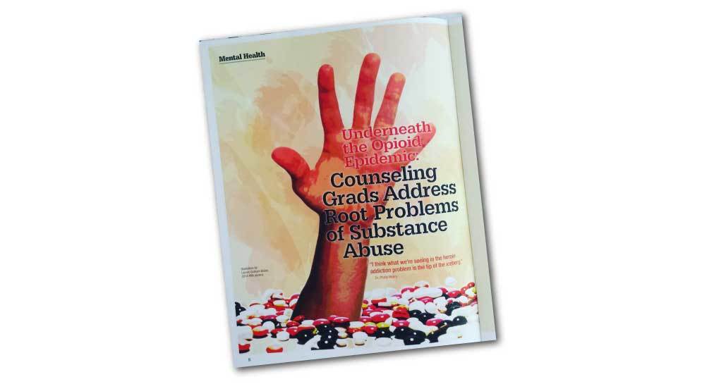
A common symbol for a drug is a pill. When we think epidemic or addiction, we think that there is too much of something. In this case, that “something” is drugs. A standard symbol of drugs is a pill, and I thought that a pile of scattered pills accurately represents the problem. But that only conveys the issue.
A common phrase in America is “reach out to.” We often “reach out” to others who need help. The idea of “offering a helping hand” is another common idea. When portraying a call for help, I thought picturing a reaching hand calling for help would be a vivid symbol.
With any design, the challenge lies in making two unrelated images come together.
To make these two ideas come together, I decided someone’s hand needed to “reach for assistance” from pile of pills. This would symbolize the cry for help of the opioid addict.
Layout
Unfortunately, in my resource investigation, I could not find any “reaching hands” that portrayed the emotion that was necessary.
That’s when personal photography skills and a helpful husband and come in handy (punintended). I told Shawn my concept and my image needs, and he willingly “lent a hand.” ;+).
My next task involved making the images “match.” These two images needed to fit together in such a way that they looked like they were originally one image. That’s when Photoshop skillz come are useful.
I want to hear your thoughts. What do you think? What do you think is the best way to portray this idea? Would you do things differently? Please leave a comment below.