What’s a simple, inexpensive way to capture the attention of your ideal customer and provide them with information about your company? If you said rack cards, you are correct!
Brochures offer the same benefits, however, brochures provide more in-depth information. Because of their size, they can go into more detail. This can be good, or bad.
If your customers want detailed information, brochures or booklets are the way to go.
If they want short and sweet (but more information than what’s on a business card), rack cards are for you.

What Does a Well-Designed Rack Card Look Like?
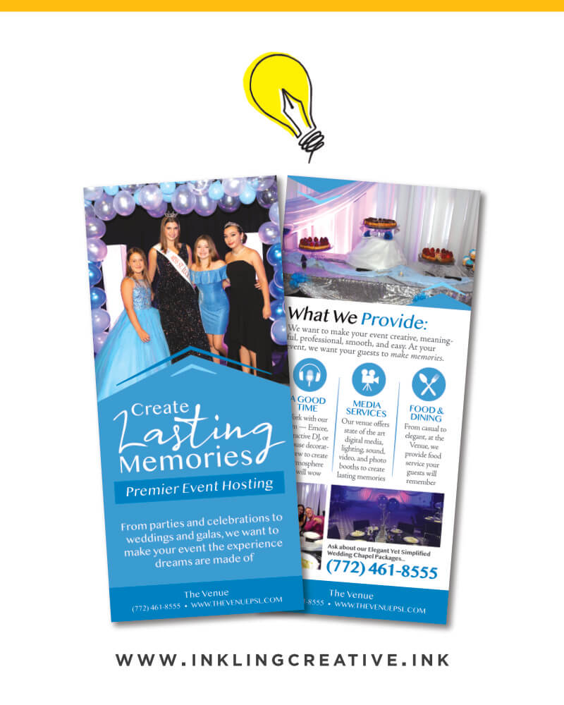
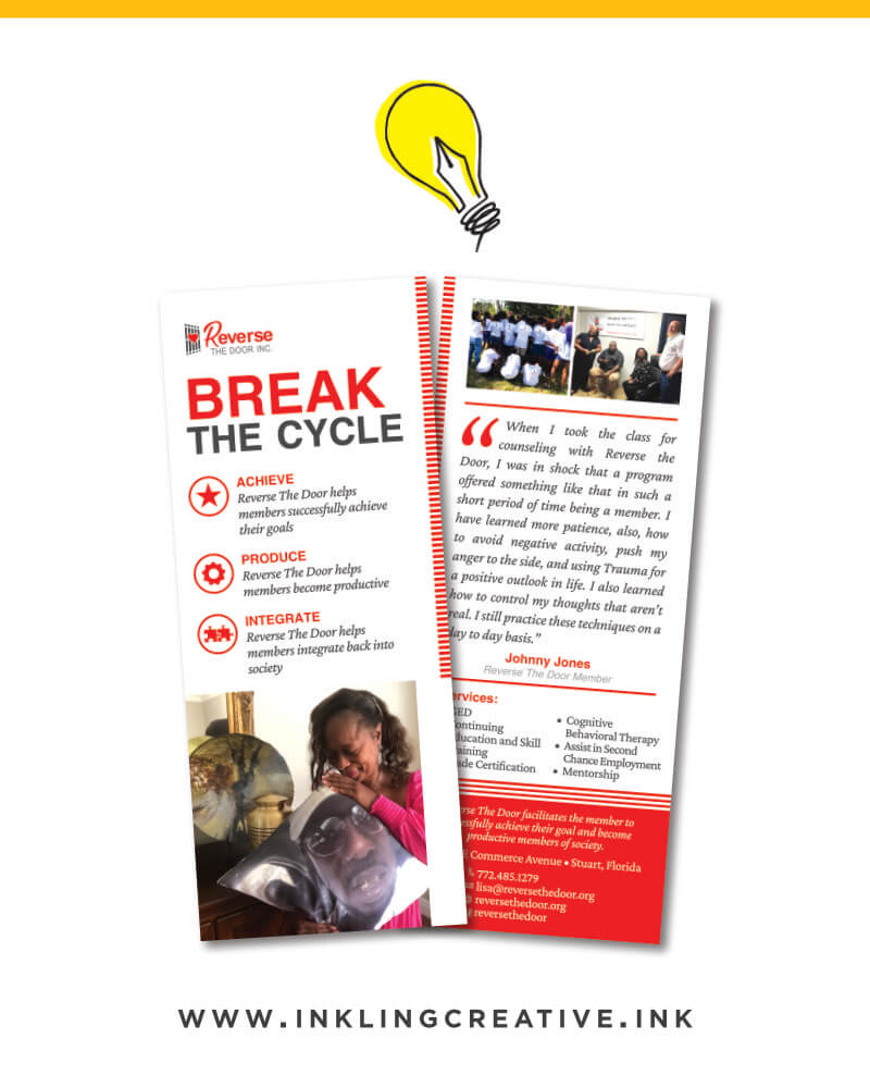
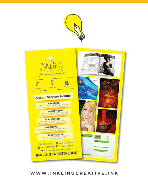
First, let's look at some examples. Below, you'll find a list of a few well-designed rack cards. You will also find explanations of some of what works about them.
- You'll see this one has one nice image with three main bullet points about the company and a call to action with contact information at the bottom.
- This one features an image that captures your attention and makes you want to look closer at the card then it has a few simple words that succinctly says what the company provides, "delicious food is here,” along with a phone number and a website.
- This one has an enticing and peaceful background image that draws viewers into the card without being distracting. Then it has the three bullet points with icons that tell you more about the company with contact information at the bottom.
- Bold colors, an interesting image, an engaging headline all make this card capture attention. An offer on the front and more information about the company on the back (along with another headline, a few images, some bullet points, and contact information) all serve to make this rack card effective.
- This card keeps it simple on the front with just two images and the company name. Then it has a few more images, company details/offers, and contact information on the back.
Someone I spoke recently with looked through different rack card options, and she noticed the most effective rack cards are simple.
They capture attention and keep your eyes focused on where you want them. In other words, they only share the most important information about your company.
The most effective rack cards are simple

If clients share with Inkling what information they want on the card, and provide a few images to choose from, we make the design decisions and deal with the wording and headlines.
Rack Card Guidelines to Get Started
When designing a rack card, asking yourself these questions will get you started on the information to provide.
- Understand who your ideal customer is when you’re choosing images and thinking about words. What will they be attracted to?
- What’s the end goal of this rack card? What do you want to tell your customers? What do you want them to do about it?
- What services does your company provide? Can you describe them in one sentence?
- Of those services, which are the most important?
- What's the most important thing you want people to know about your company?
- What contact information would you like on the card?
- Of that contact information, which is essential?
- What's the best way to contact you?
- After this, consider. Do you have any testimonials you can share from people who have benefited from your services?
Printing Rack Cards
When deciding on the printing of your rack cards, answer the following questions.
- How many cards would you like? Would you like to see different quantities?
- What kind of paper would you like it on? Standard, thick stock? How thick? Semi-gloss or not?
- We can print two sizes: 3.5"x8.5" or 4"x9." (Non-standard sizes cost more.) Do you have a preference for which size? Consider the use and the goal of the card.
- Would you like any special effects (we can do spot UV — this makes the portion of the card you choose extra shiny or Akuafoil — this creates an array of metallic, foil colors)?
- Special effects have been shown to increase your return on investment
The Goal
In addition to these tips, there's one final element we must consider. Every time we move forward with a marketing effort for our company, we need to ask ourselves, “what’s the goal of this piece?”
The goal of a rack card is to establish authority (you know what you’re talking about) and show why your company is memorable — along with what your customers/prospects should do about it.
As we’ve discussed, a memorable company will capture the attention of the right customers, create solutions to their problems, and change their lives.
A rack card simply shows how your company is memorable — and makes a statement while doing it.
If your company needs to make a statement with a rack card, contact Inkling Creative today!


