
“Don’t judge a book by its cover.”
“You never get a second chance to make a first impression.”
More...
Words you heard your mom say are true in life and just as true in business. Wisdom like this is why good branding is essential. Why? Because “branding pre-sells the product or service to the user” says The 22 Immutable Laws of Branding*. This “pre-sale” is a judgment a customer makes about a company before he or she knows anything else. As it is (unfortunately) in real life, it is the same in business. This judgment is usually based on appearance. Because this is true, how a brand looks is extremely important.

The Elements of a Visual Identity
When you think of branding, what do you think of? What comes to mind for most people is a logo. While this is probably is the most distinguishing part of a visual identity, it is not the only part. A visual identity consists of several different elements, clearly described by Marriah of Tarango Visual. These are a company’s logo, photos, social media graphics, website, and business cards. It is extremely important to keep these visually consistent – more about that later. We will begin by discussing the most recognizable part of a visual identity - the logo.
The Logo
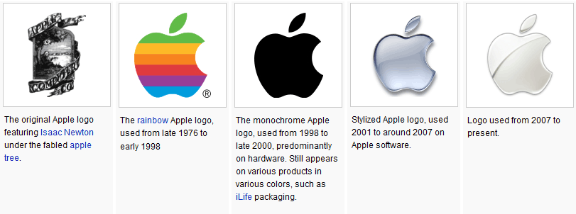
While a logo is not the only part of a company’s visual identity, it is the most defining and often the most enduring. When we see major companies rebrand, when the logo changes, it usually doesn’t change much. Take Pepsi for example. When Pepsi rebranded, it took their trademark red, white, and blue circle and "simply" made the white inside a different shape. Look at the evolution of the Apple logo. Other than the first major overhaul of the logo, throughout the remaining years it has gone through only minor tweaks.
While a logo is not the only part of a company’s visual identity, it is the most defining and often the most enduring.
If we take a look at Company Folders’ 10 Best and Worst Logo Redesigns Ever, the ones that they deem the worst have the greatest change between original and new. The ones considered the best, overall, have the least amount of major change. These logos result in the greatest improvements. There are exceptions to the rule of course, but most often, when a logo changes, it’s not a major shift in appearance. Because the logo is the most enduring part of your visual identity, it is the most important part. Your logo helps direct your visual strategy.
When designing a logo, several laws, or best practices, must be kept in mind as defined by Al and Laura Ries.
The Law of Shape
According to their book, The 22 Immutable Laws of Branding, the structure of the human being (our eyes our side-by-side not on top of each other) determines the best logo shape. (For more information on shape, visit here.) The ideal shape for a logo is about two and a quarter units wide by one unit high. A logo this shape provides maximum impact. For example, the Avis logo is much more effective than the Arby’s logo because of its shape. Components of a logo’s shape involve its typeface and its symbol.
Typeface
In typography, a typeface refers to a font family. A font family is a set of characters, or letters and glyphs, that share certain similarities. For example, a typeface is Times New Roman; Times New Roman Bold is the bold version of Times New Roman.
The typeface in your company’s logo says a lot about your company, so choose it carefully. The typeface can influence a customer to believe your company is strong, professional, traditional, formal, modern, or juvenile. For example, sans serif typefaces look modern, serif typefaces look traditional or old-fashioned. Bold typefaces look strong; light typefaces look feminine. But more important than the style of your typeface is the legibility of your typeface. A logo, and thus logotype, has virtually no meaning if it is illegible.
Symbol
The trademark, or visual symbol, of a logo is another aspect of shape that is often overrated. It is not the symbol that gives a company or logo its meaning, but the words. “The power of a brand lies in the meaning of the word in mind1” not the symbol. But it can be a visually identifying mark of a brand. So if your logo does include a symbol, make sure it represents your brand well.
(Edited to add: Now that we have seen more and more companies that have dropped names from their logo, it's the words, or name, the symbol represents.)
The Law of Color
Another best practice of logo design is the law of color. When choosing brand colors, it is important to consider color psychology, or what certain colors represent. For example:
- Red often attracts attention and is considered an appetite stimulate, that's why it's so often used for restaurants, it can also symbolize anger or toughness
- Orange communicates warmth and optimism
- Yellow conveys creativity
- Green is the color of growth or environmental-friendliness
- Blue communicates stability or leadership
- Purple speaks royalty or quality
- White is the color of purity
- Black is the color of opulence or luxury
Naturally, the best color for your logo is the one most symbolic of the category (i.e. red for food or green for farming). This list is not exhaustive for everything a color communicates.
One other thing to consider when choosing color is color consistency. If your company becomes well-known and you standardize a color, you build a powerful visual presence. If a woman sees a Tiffany blue box under the Christmas tree, she doesn’t need to get closer. She doesn’t need to know what the box says. It means one thing.
That’s the power of color.
A logo is the first and most important part of a visual identity, but it’s not the only part. A company’s logo sets the tone for the rest of their branding. If a logo is clean and simple, the rest of a brand will be clean and simple. If a logo is geometric, the rest of the brand will be geometric.
Convinced you need a logo, but not sure where to start? Contact Inkling Creative today.
What do you think? What are the first things you think of when you think of a company's visual identity? Comment below with your thoughts.
Thank you, Lauren! Your content is helping to guide me as a student of Graphic Design.
Thank you so much for your encouragement! I’m glad you are being helped, please let me know if I can help in any other way :+)