
I know it's been a while since you've heard from me, and I wouldn't break that silence for just anything.
But this one's personal.
My logo design for the 50th Anniversary Gate River Run 15K made it to the finalist round. But before I tell you about the vote, I want to tell you about the logo. Because the story behind it is the whole point.
It Started With a Bridge
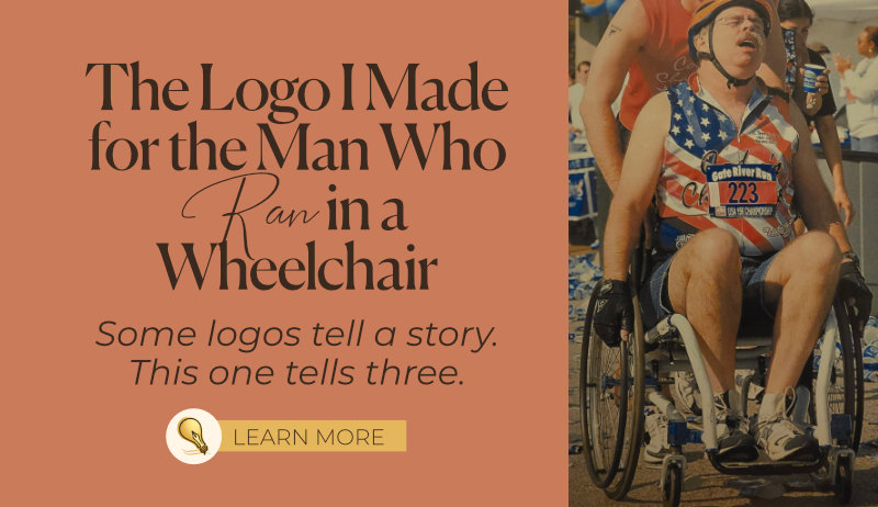
My father-in-law, John Waller, is one of only 17 people in the world who has run every single Gate River Run since it began in 1978. He's called a "streaker" — he's never missed a year. Not even the year he broke his femur. He "ran" that one in a [regular] wheelchair...after a bolt came off in the first few miles.
When John sent me this contest, I almost didn't enter. I'm not from Jacksonville. I didn't grow up knowing the course, the culture, or the community the way my husband did. What did I have to offer?
Then I Googled the Hart Bridge.
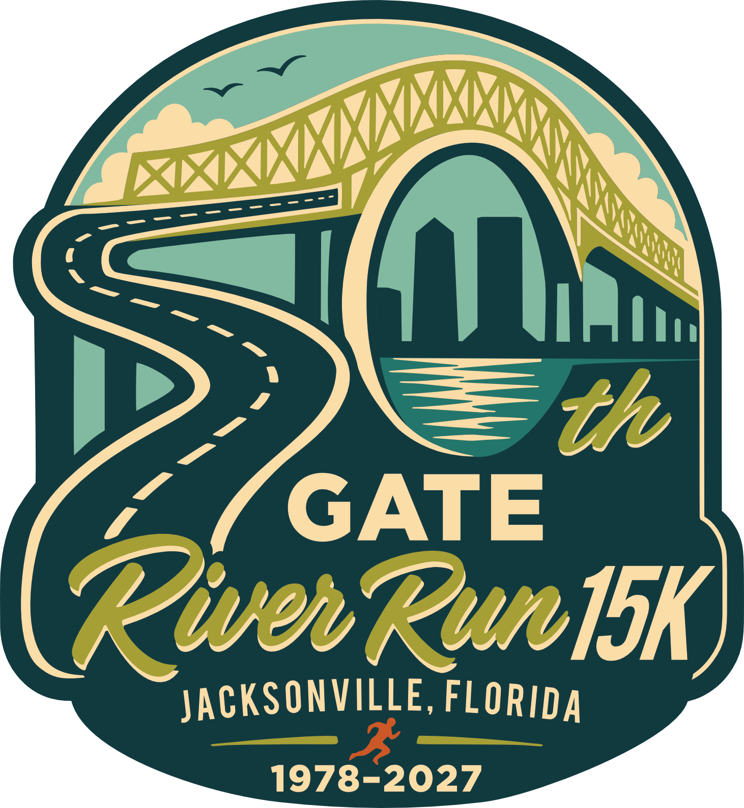
Runners call it the Green Monster — the punishing final climb that separates the finishers from the finalists. When I saw the first photo, I didn't see a bridge. I saw a 5. I kept looking, and the arch closed into a 0. A road winding toward a bridge, forming the number 50 for the 50th running of the race.
The bridge begged me to enter.
What the Logo Means
The concept is simple once you see it, and impossible to unsee once you do.
The Hart Bridge is the number 50. The sweeping road forms the five; the soaring arch closes the zero. Jacksonville's skyline sits quietly inside the arch, reflected in the St. Johns River below. Birds, clouds, the Green Monster herself, all rendered in a vintage badge aesthetic that honors 50 years of grit without taking itself too seriously.
This logo is for John. And it's for everyone who has ever shown up when showing up was hard.
Why Making Things Memorable Is Personal to Me
As many of you know, I founded Inkling Creative after surviving a traumatic brain injury that required me to relearn how to form and hold memories. Making things memorable isn't just what I do — it's what I fought to be able to do again.
Our tagline, making companies memorable, isn't marketing language. It's a mission. And this logo is a small piece of that story too.
When John crossed that finish line from a wheelchair, he wasn't just completing a race. He was refusing to let a broken bone write the end of his story. I know something about that kind of refusal. This logo is where both of our stories meet.
I guess perseverance runs in the family.
The Vote
The finalist round included a public vote, and I'm grateful for every person who took 30 seconds to click a link for me that weekend. The vote isn't the only deciding factor — and honestly, making it to the finalist round of the largest 15K (over 20k participants) in the United States already feels like a win.
But more than the outcome, I'm proud of what this logo represents. Fifty years of a race that builds community. A father-in-law who never quits. A designer who almost didn't enter — and then couldn't not.