
Some links in this post are affiliate links, meaning that if you click and buy something from the site, I may get a small commission (at no additional cost to you).
When you think of movement, what do you think of? A prowling lion? A racing cheetah? Dancers sashaying around the dance floor? Usually when we think about movement, our thoughts lean towards biological creatures – not inanimate objects.
More...
Well, let me introduce you to another principle of design: movement.
What is movement in design?
Before you dismiss me, let me explain what graphic designers mean when they talk about movement in art. And no, it does not refer to relocating a piece of art to another room. Rather, movement is what an artist uses to guide a viewer's eye in, through, and out of a composition (UTexas). Movement is the path a viewer's eye takes through a composition. In an image, the kinds of lines, shapes, and forms an artist uses can affect this movement.
In the last blog post, we also discussed how heavily emphasis in visual hierarchy guides the movement of an eye throughout a composition. This is just one example of how movement is used in a composition.
Another example of movement is the elements of design that are used. When we discussed lines, we talked about how diagonal lines innately possess their own movement. They suggest this in what they cause us to think about.
For example, a curved line frequently evokes images of a dancer.
A diagonal line suggests a sprinter ready to burst forward in an explosion of speed.
Examples of movement in art
These woodblock prints by Katsushika Hokusai are excellent examples of line and movement and how this principle of movement is used within a composition. Take note of where your eye immediately goes when viewing these pieces of art.
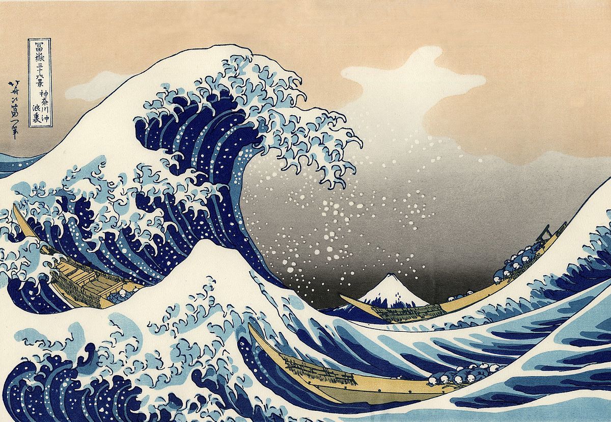
The Great Wave by Katsushika Hokusai
In The Great Wave your eye begins at the left and is carried to the right by the movement and curves of the crashing wave.
When the wave is followed to its natural end point, the eye is led to Mt. Fuji in the background which you may not have seen until your eye was led there.

Red Fuji by Katsushika Hokusai
In Red Fuji the curved lines of the sides of the mountain carry your eyes to the volcanic peak.
For graphic designers, this has significant implications. When used properly, movement in design ultimately guides viewers through a composition to where the designer wants them to go. Put succinctly, designers use design elements to guide viewers to the call to action. Put bluntly, design — done correctly — makes your cash register ring.
Designers use design elements to guide viewers to the call to action
Where is your design leading people?
Good design doesn't just look good. It guides attention.
Take a look at one piece of your marketing — a brochure, flyer, ad, website page, or even your business card — and ask:
What do I notice first?
What do I notice second?
Where does my eye end up?
Is that where I want my customer to go?
If you're not sure, your audience probably isn't either.
Get the free 5-Minute Visual Hierarchy Check
Use this simple worksheet to see whether your design is directing attention toward the message — and action — that matters most.
✦ Want a deeper look at whether your company is being understood, remembered, and acted upon? Start with a Memory Audit.
For a real-world example in a logo, look at the 50th anniversary Gate River Run logo. The top of the five (or road) leads to the Hart Bridge — the most memorable landmark in the race itself (also known as the Green Monster). The bottom of the 5 leads to the actual title of the logo itself: the River Run. The movement of the 5 guides the viewer's eye to the focal points of the logo.
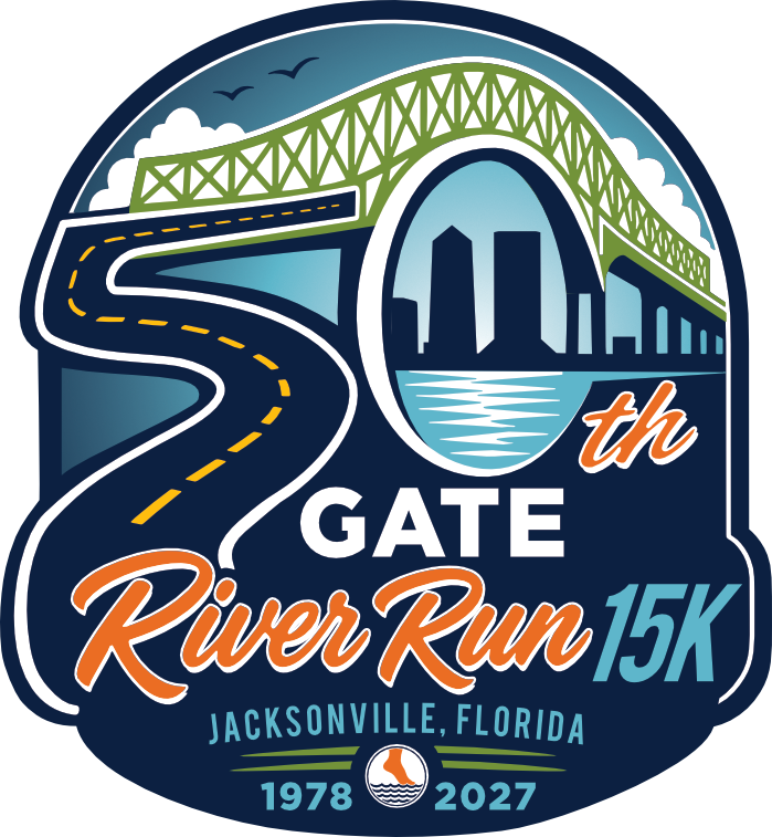
Designed by Lauren Waller • Inkling Creative
Good design tells the eye where to go. Good communication tells people what to remember.
Movement is only one part of effective visual communication. Your typography, hierarchy, color, imagery, messaging, consistency, and brand all influence what people notice — and what sticks with them afterward.
That's the question behind much of my work at Inkling Creative:
Will people understand it? Will they remember it? Will they know what to do next?
If you're not sure how well your company's visual communication is answering those questions, start with a Memory Audit.

Rhythm is a principle of design that suggests movement or action. Rhythm is usually achieved through repetition of lines, shapes, colors, and more. It creates a visual tempo in artworks and provides a path for the viewer s eye to follow.
You are absolutely correct! I would classify rhythm as kind of a subcategory of movement because rhythm does itself create movement. This is definitely an area where I could elaborate some more. Thanks for your input!