Blue sky. Red flowers. Green plants. Yellow sun. We take one look around and we see that the world is full of color. There are few things in design are more subjective than color. There are few things that attract more attention. There are few things that promote more reactions than color.
More...
Within 90 seconds or less, people decide if they like a product or not. Ninety percent of that decision is based on color alone (99designs). With its ability to provoke such strong reactions, color is obviously important. We also know that logos are important. Thus, the logical conclusion is that logo color choice is obviously important. But choosing the best logo colors needs to start somewhere besides just knowing its importance. So where does it start?
With its ability to provoke such strong reactions, color is obviously important.
Color Psychology
Selecting the right colors for a logo starts with an understanding of color psychology - the meaning of specific colors.
Color psychology begins by understanding that every color has meaning. All colors represent something different. Choosing the right brand colors first goes back to understanding the purpose of a logo, and thus, the purpose of your company.
When a company’s purpose is rightly understood, you must then understand every color and its associations. You must understand that a brand’s colors give it meaning.
Some people want to know if there are specific logo colors that sell. While some colors may “sell” better because of a specific industry or a company’s branding, I believe the best colors are the ones that fit your brand.
After a primary color is chosen, depending on the company and the logo, secondary colors must be chosen. This is where color theory comes in.

Color Theory
Color theory for logos then is both the science and art of color. It is the knowledge of how humans perceive colors, how colors mix, and how colors communicate.
When first learning about color, it is helpful to learn terms like additive, subtractive, hue, value, saturation, warm, and cool. But while it is certainly helpful, it is not necessary to know what the terms mean. However, it is essential to know the concepts so that you choose the correct color palette.
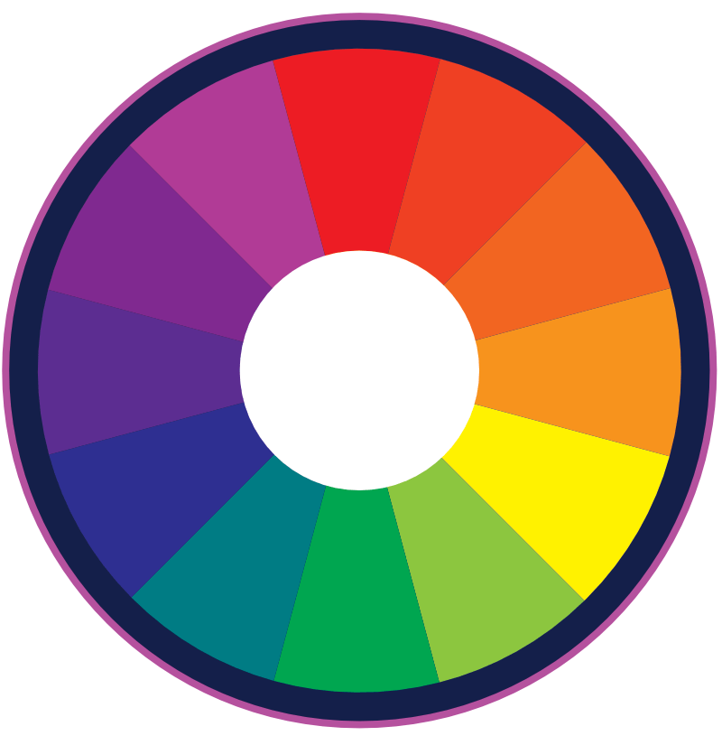
When choosing a logo color palette, it is important that all of your colors function well together. Choosing such colors involve learning how to use a color wheel. When used correctly, color wheels ensure that colors will work well together.

Complementary
Complementary colors are colors that are on opposite sides of the color wheel. For example, red and green, orange and blue, yellow and purple, are all on opposite sides. Because of the contrast, using a color’s complement really makes an image pop.
Analogous
Analogous colors are colors adjacent to one another on the color wheel (i.e. green, blue, and purple). When using an analogous color scheme, one color will dominate, another will support, and the other will accent.
Triadic
Triadic colors are three colors evenly spaced around a 12-color color wheel. A triadic color scheme simultaneously creates visual harmony and contrast. This makes each item (and the overall image) stand out. The Burger King Logo is an excellent example of a triadic color scheme. It uses red, yellow, and blue.

Why Should You Care?
You may be saying to yourself, “color theory…color psychology…this is great for designers. But as a business owner, why should I care?”
Three reasons: branding, marketing, and sales. With this simple knowledge of color, you are not only equipped to make a good decision on the color of your logo, you know what emotions certain colors evoke. You also have the knowledge to make good decisions on the colors of your website.
Not only does a knowledge of color guide you in the best logo color choice, it guides you in your marketing and helps you understand your competition. Good color decisions lead to more sales and bad ones can lead to poor sales. That’s why you should care.
What are your thoughts? Have you seen good examples of color usage? Bad ones like this? Please share!

